Marketing: Brochures for Pearson Education
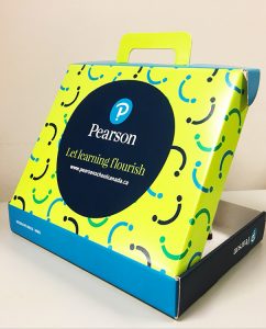
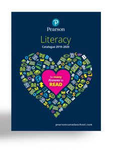
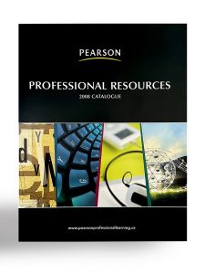
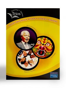
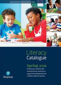
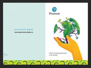
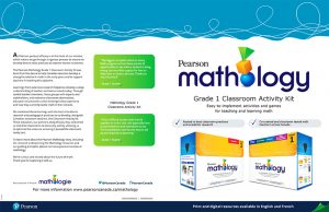
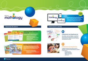
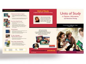
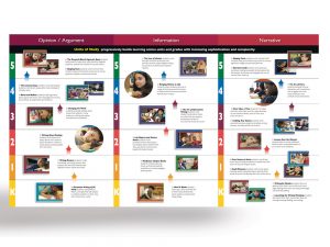
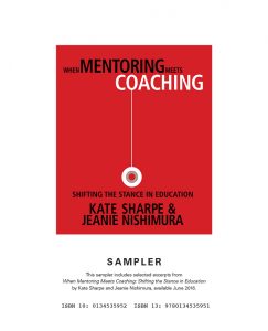
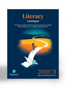
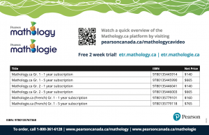
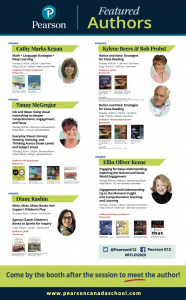
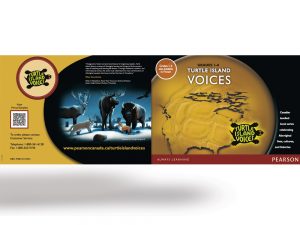
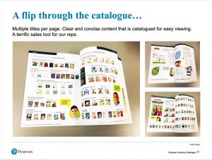
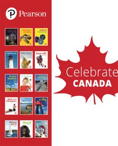
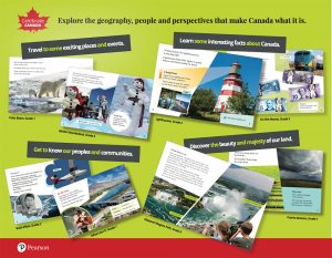
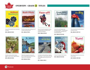
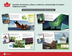
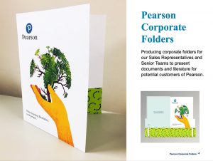
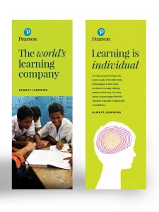
Design: Examples of my design and production work for Pearson for their multiple brochures and print material. The fonts, colour palettes, art components, and illustration choices are displayed in the work. The content is produced and displayed through print material such as brochures, catalogues, and mail postcards to aid the sales team. I have created the pieces above in both print and digital formats as well as printable PDFs, to be downloaded from the company’s website.
Promotional Items: Pearson Education
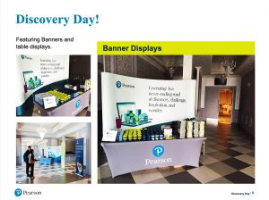
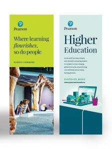
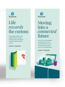
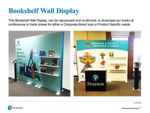
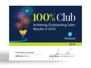
Design: The importance of designing for a large corporate brand is to maintain a consistency in the design style. This is shown in Pearson Education’s brand internationally. It is always at the forefront of my choices, as I implemented and made choices for the design that was created. This refers to the fonts, colour palettes, art composition, illustration choices, and design styling to maintain the important continuity required. Here are samples above showcasing my production and design for Pearson Education’s branding, and imagery for all of our conferences. I have designed the promotional material for large trade show displays to emphasize the brand, using various pull-up banners, table signage and brochures.
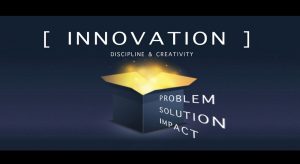
Concept meetings: Innovation - Pearson Education
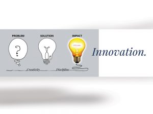
Design: I designed and produced the visual concepts to showcase the word ‘innovation’ with these accompanying word components that came from their focus group. (ie. Problem, solution, and impact – together with discipline, and creativity, leads to Innovation.) The concept meetings for the continued evolution to innovate, and develop a culture of leading & learning through education, is ongoing at Pearson. The graphics and images seen here are used in executive PPT presentations for various circumstances as required. They are also used within their ‘internal web portal’ for their employees, as round table discussions on the subject. The goal to continually evolve on how to improve, and innovate for the future within the education industry is always at the forefront.
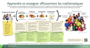
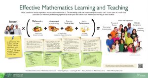
Ontario Ministry of Education, Canada
Design: I designed and produced visual concept posters, to showcase MATHEMATICS learning, assessment and teaching instructions for the Ontario Ministry of Education, Canada in both English and French. I have selected the imagery, and designed the graphics to meet the specific approvals of the department. The importance of diversity and inclusion are always a consideration in the design treatments.
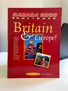
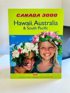
Catalogues: Canada 3000 Holidays
Design: As the designer and production manager for Canada 3000, I was the lead for the art direction, design, and production of the marketing department. Beyond the design, the company had saved $120K per year by my recommendations to manage, design and produce all the creative material internally in Toronto. I centralized the print buying and distribution of the catalogues on a national basis. Canada 3000 Holidays was VOTED #1 two years in a row for ‘Overall Creative Brand Image and Service Holiday Company’ — by Canadian Travel Agencies, in an article with TRAVEL PRESS MAGAZINE.
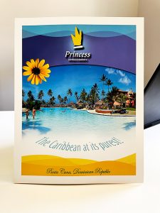
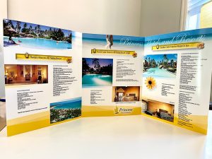
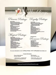
Brochures: Princess Hotels and Resorts
Design: The objective for the design approach was to create and design high quality brochures featuring Princess Hotel and Resorts. They have 4 properties in Punta Cana, and the Dominican Republic. I chose 110 lb card stock, with a premium high gloss finish to produce the tactile feel they were looking for. To complement their brand, I used shades of blue, and yellow tones throughout the 6 page fold-out. It was very well received. It was used as promotional material for their sales team in conferences.
Logo Designs
Design Sample 1: I have created logo designs for Pearson Canada’s program titled: Spark Reading. I created logo design samples in various forms in brainstorming sessions with the internal clients – product division.
